Annotate Kit
For the web  ·  For iOS

Point at the pixel.
Ship the change.

Annotate any page, restyle it live, wireframe a component — and get one precise prompt to paste into whatever AI you already code with: Claude Code, Codex, Cursor, OpenCode. No screenshots in Slack, no "the blue button under the second card, no, the other one".

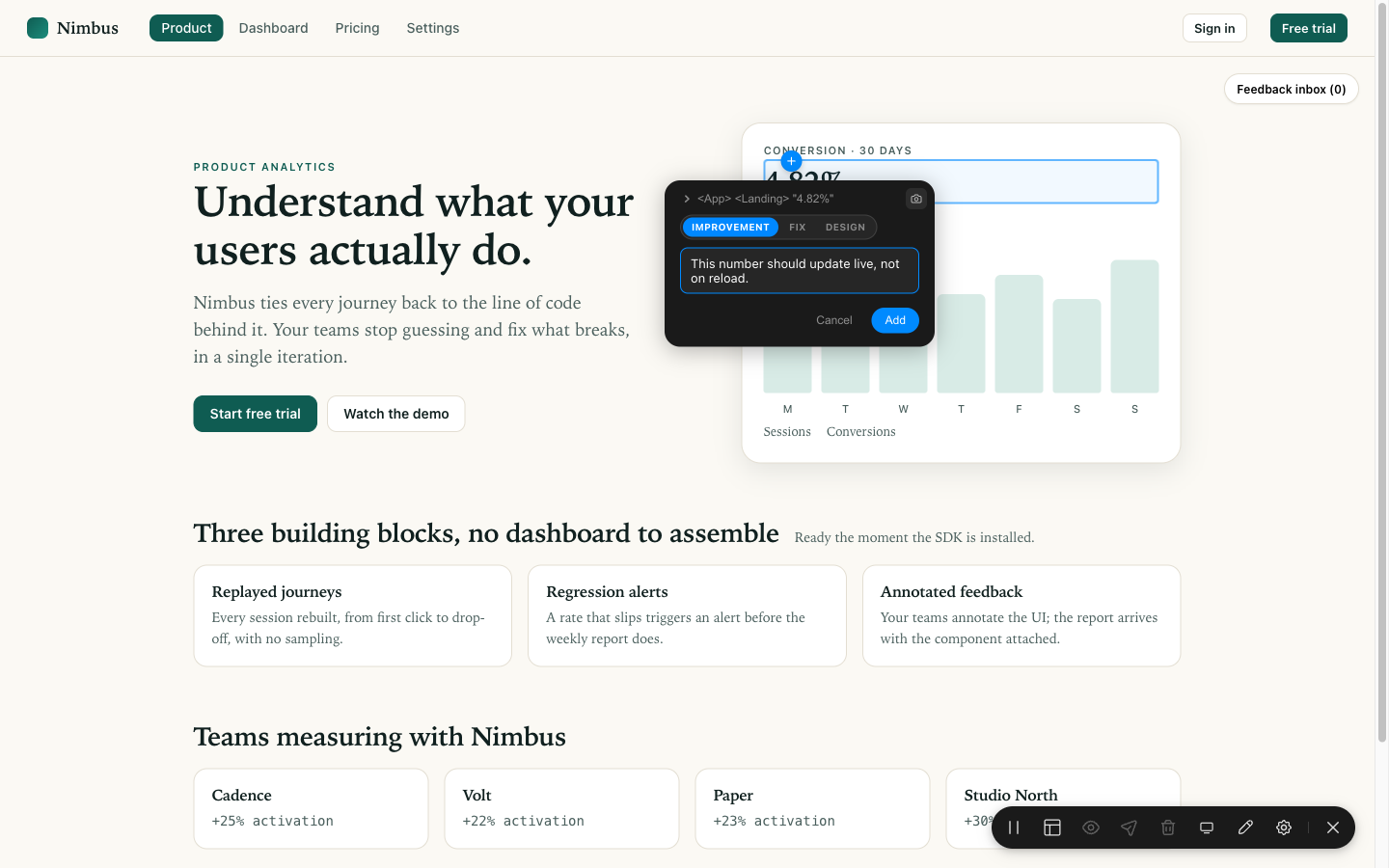
An annotation card open on a live page, with Improvement / Fix / Design chips and a note being written.
The real thing, on a real page. Click an element, pick a kind, write the note.

Whatever you already use

It does not replace your AI. It writes its prompt.

Annotate Kit has no model, no API key and no opinion about which agent you should use. What comes out is text — one precise, structured prompt — so it works the same whether you paste it, pipe it over MCP, or send it to a webhook.

Claude Code Codex Cursor OpenCode Copilot Windsurf Your own agent

The gain is upstream of the model: a prompt that already carries the element, the component, the file and the line does not send your agent hunting through the repo — which is where the tokens and the iterations go.

One idea, two products

Annotate Kit for the web. Annotate Kit for iOS.

Same workflow, same design language, same annotation schema — two independent implementations, because a web page and a native iOS screen are not pointed at the same way. Pick the one that matches what you are building; the message your agent receives is the same shape either way.

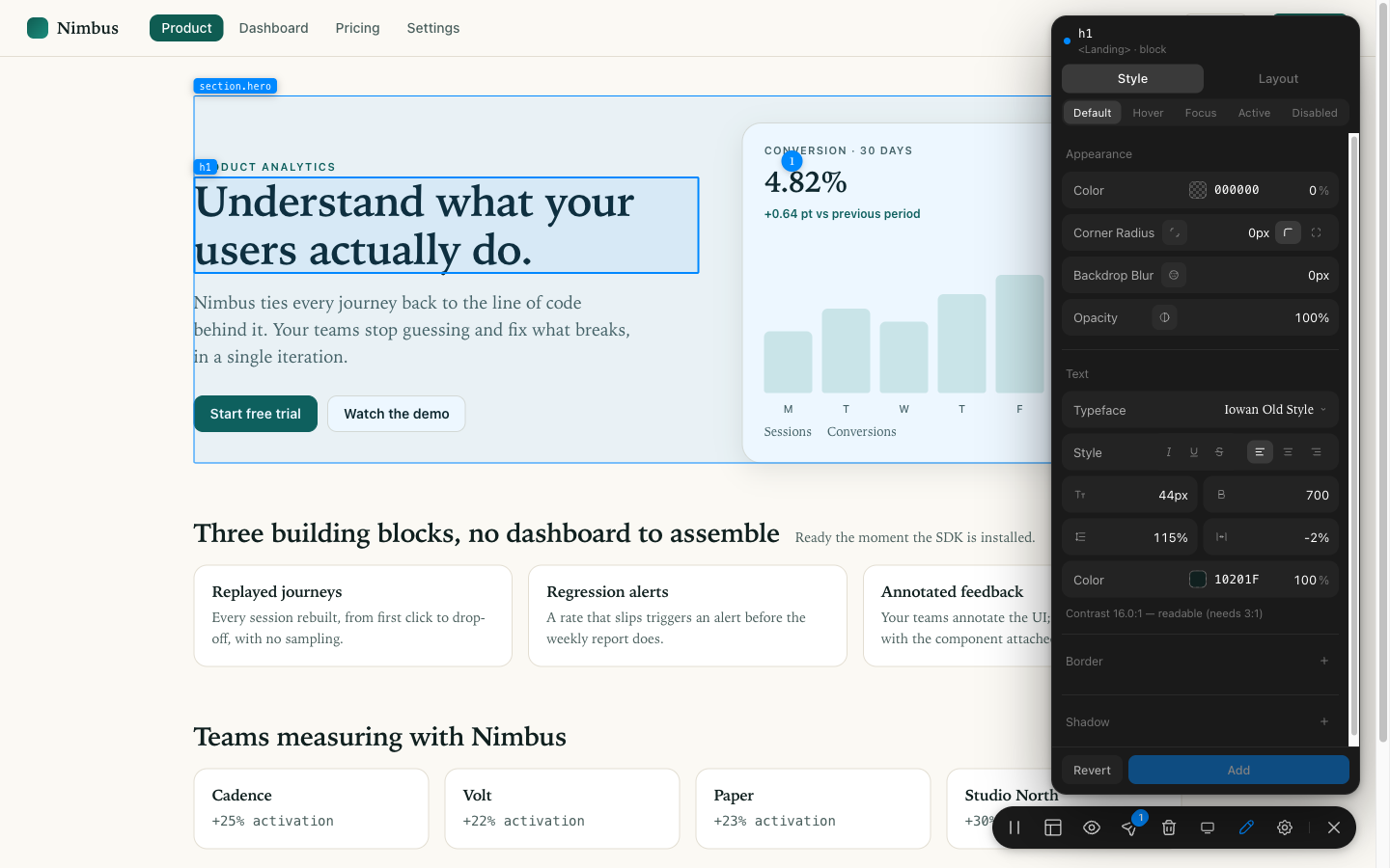
Annotate Kit's design inspector docked on a live web page, restyling a real element.
For the web

Annotate any page, restyle it live

A JavaScript package that mounts an overlay on your running site: annotate, open a Figma-style inspector and change the real CSS, or wireframe a whole component — then send one agent-ready message.

Stack
JS / TypeScript · React, Vue, Svelte, plain HTML
Install
npm install annotate-kit
Repo
annotate-kit-web · private
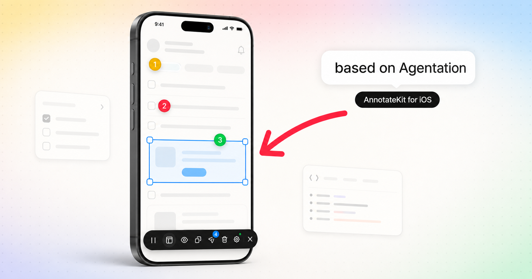
Annotate Kit running inside a native iOS app, annotating a live SwiftUI element.
For iOS

Tap any element of your running app

A Swift package for SwiftUI, Debug builds only. Tap the floating toolbar, tap an element, write a note: your agent gets the accessibility identity, the view chain, nearby texts and a marked screenshot — live over MCP if you want.

Stack
Swift · SwiftUI · Swift Package Manager
Install
.package(url: "…/annotate-kit-ios")
Repo
annotate-kit-ios · public

Everything, in one place. Four repositories, one family — this is where each of them lives.

Why

Your agent cannot see what you are pointing at.

Coding agents are good at changing code and blind to the screen. Every design review turns into an exercise in describing pixels in prose — and the agent edits the wrong component, or asks three questions before touching anything.

What you send today

"hey can you make the card on the pricing page a bit lighter, and the heading is too big on mobile — not that card, the one with the chart"

Screenshot attached. Three follow-up questions. Two wrong files touched.

What Annotate Kit sends

div.hero-card · <Landing>
pages.tsx:44 · written at Phone · 390px
background-color: #FFFFFF → var(--paper)

The element, its component, the source line, the screen width, the exact value.

How it works

Three steps, one message.

1

Point

Click any element on your running app. The kit captures its selector, DOM path, React component, source line, computed styles and the text around it.

2

Change

Write a note, or restyle the element live in the inspector, or grey a component down and move its blocks. All three land in the same batch.

3

Hand over

One message, sorted into lots — design, fixes, features — with instructions to run each lot in parallel and which items must go to the same worker.

Features

Everything a design review needs, on the page itself.

Annotate mode

The classic loop, sharpened: click, choose Improvement, Fix or Design, write what should change. A numbered marker stays on the page so you can see what you have already said.

  • Element identity an agent can grep: selector, DOM path, component, source line
  • Kind chips, so the batch sorts itself
  • Screenshot of the element, taken by the browser — no host setup
  • The batch, laid open: click the count to review, reveal or drop any item
Annotation card with kind chips and a note

Design mode

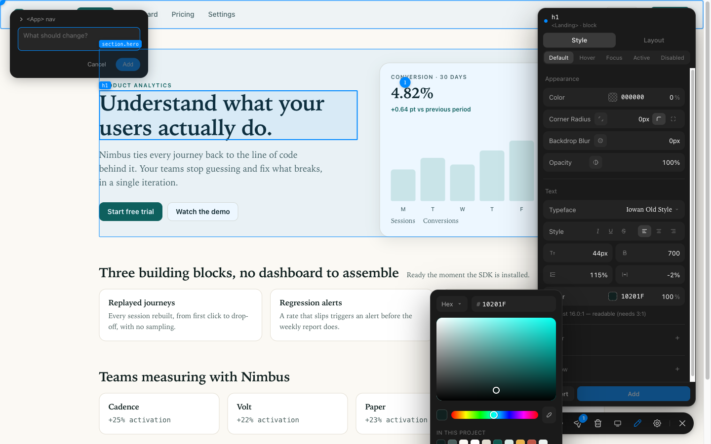
A Figma-style inspector docked on the right. Restyle the real element — colour, type, spacing, radius, shadow — and watch the page change under you. Every edit is recorded as a before/after the agent can apply to the source.

  • States: design the hover, focus, active and disabled versions, not just the one on screen
  • Your palette: the project's own colours and typefaces, read off the page, offered first
  • Guardrails: off-rhythm spacing and unreadable contrast are flagged, never blocked
  • Edits reference your design tokens (var(--brand-500)), not raw hex
The design inspector open on a heading, showing type, colour and a contrast readout
The contrast of the chosen colour, checked against what is actually behind the text.

Wireframe mode

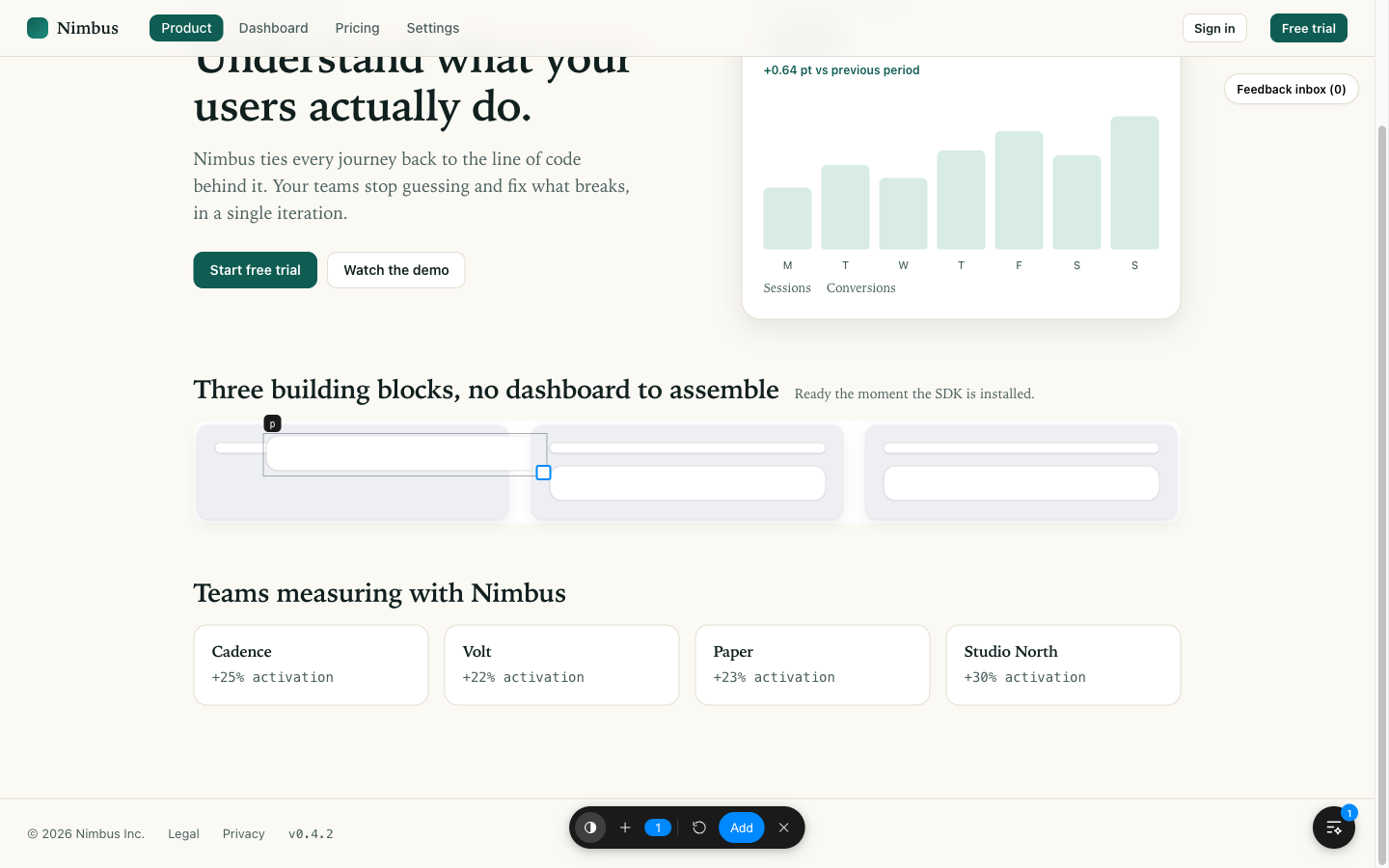
Pick a component and it drops to grey and white blocks — no text, no images, no opinions. Drag the blocks, resize them, remove one, add another. You are asking for a new arrangement, not describing one.

  • Only what a person can see becomes a block: invisible wrapper divs are walked through, never drawn
  • Drag, resize, drop and name each block
  • The result ships as an annotation, with the before and after geometry
Three cards reduced to grey wireframe blocks, one of them dragged out of place

Every screen size

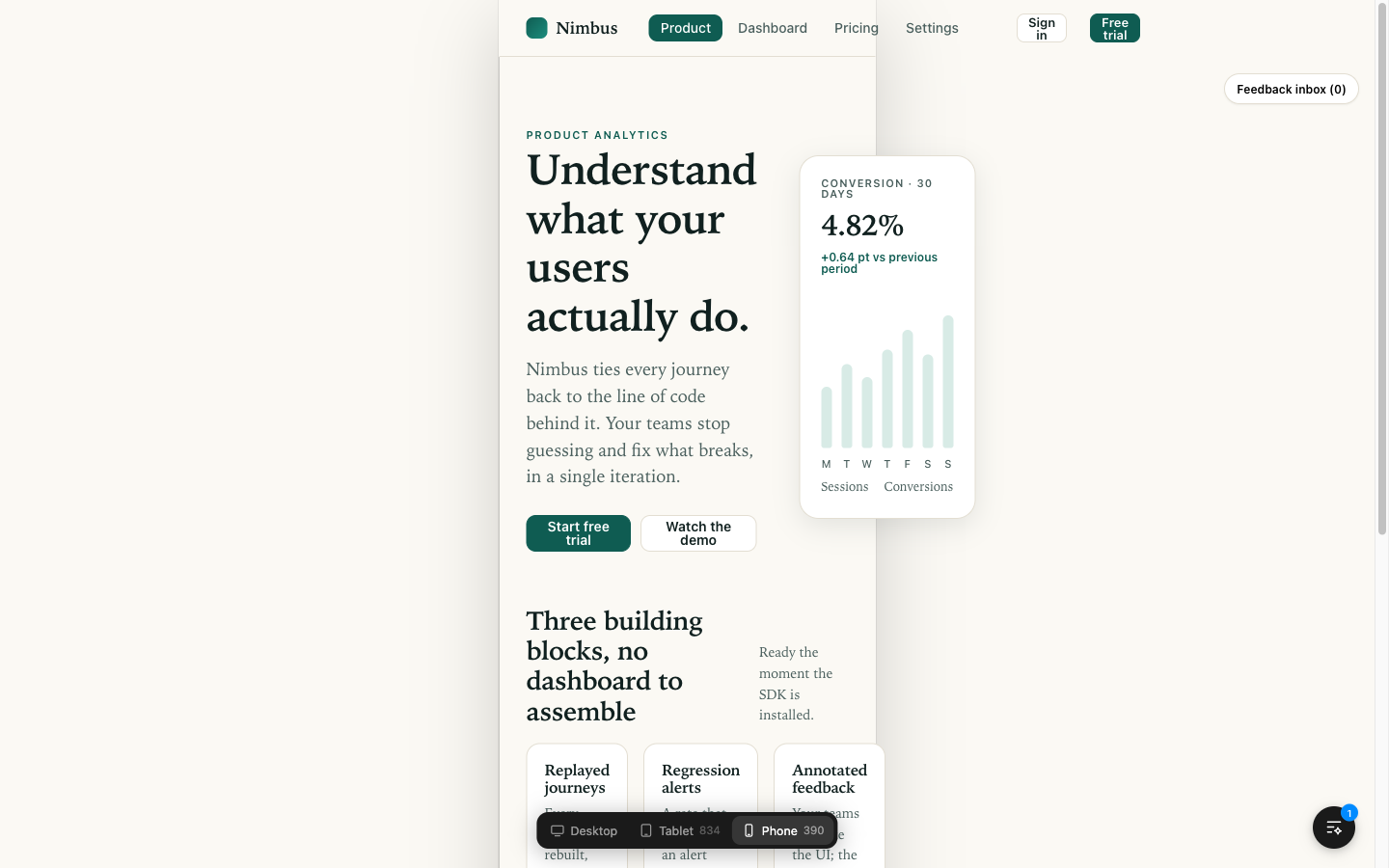
Desktop, tablet, phone — from the toolbar, without leaving the page or losing the session. Every note records the width it was written at, because "make this smaller" means opposite things at 1440 and at 390.

  • Written at Phone · 390px travels with each item
  • Annotation pauses while you choose a size — the modes never fight
The page narrowed to phone width with the size switcher open

Your project's own palette

The colour picker opens on the colours the page already uses — read from its CSS variables, or from what it actually paints when there are none. Pick one and the agent is told it is --ink, not #10201F.

  • Works on the first connection to any codebase: Tailwind, CSS modules, plain CSS, styled-components
  • Off-palette colours are named as such, and still allowed
  • An eyedropper, for the colours that are on screen but not in the system
The colour picker showing the project's own palette under the saturation square

Who it is for

So designers can finally ship the change themselves.

Vibe-coding works right up to the moment you have to describe a screen in words. A designer knows exactly what is wrong and cannot say it in a way an agent can act on; a developer can say it and did not notice it. Annotate Kit removes the translation step: you point at the thing, and the agent receives the thing.

Designers

Change it live in the inspector, in your own palette and your own type scale. What you send is not an opinion, it is a diff waiting to be applied.

Everyone who is not technical

Product, marketing, support, a client on a call. Click, write a sentence, done — no selector, no screenshot, no "second card from the left".

Developers

Feedback arrives with the component, the file and the line already attached. No triage, no going back for the missing half of the question.

Why it costs less

A precise prompt is a cheap prompt.

An agent that does not know which element you mean has to go and find out: grep the repo, open candidate files, read components, guess, ask, try, be told it is the wrong one, try again. Every one of those steps is tokens in and tokens out — and the search is the expensive part, not the fix. Hand it the selector, the component, the source line and the exact before/after value, and there is nothing left to search for.

The same request, two ways “Make the pricing card lighter, and the heading is too big on mobile.”

Described in words

    Tokens
    Round trips
    Right first time

    Sent with Annotate Kit

      Tokens
      Round trips
      Right first time
      Described in words
      With Annotate Kit

      An illustration, not a benchmark: the step counts come from what an agent actually has to do to locate an element it was described in prose, and the token figures are rounded orders of magnitude for a mid-sized codebase. Your numbers will differ. The shape will not — searching costs more than fixing.

      What the agent gets

      One message, already a plan of work.

      Not a list of complaints: a briefing. The batch is sorted into lots by kind, each lot split into groups that cannot touch each other, with the instruction to run one sub-agent per group — and the reason why the rest must not be split.

      ## Page feedback — /pricing
      
      - **Items**: 5
      - **Annotated at**: Phone · 390px
      
      ## How to work through this
      
      3 kinds of work, 3 independent groups in total. Run one sub-agent per group —
      every group below touches a different part of the page.
      
      ### Design — 2 items
      - Group 1: items 1, 2 — one worker takes all of them, in this order.
        These elements contain one another, so splitting them would have two
        workers changing the same component from two directions.
      
      ## Design (2)
      
      ### 1. Design — background-color: #FFFFFF → #FBF9F4
      - **Element**: `div.hero-card`
      - **Selector**: `div#root > div.shell > section.hero > div.hero-card`
      - **React component**: `<Landing>` (`src/pages.tsx:44:9`)
      - **Written at**: Phone · 390px
      - **Design edits (1)**:
        - `div` (`:hover`) · `background-color`: `#FFFFFF` → `#FBF9F4`
          "newValueToken": "var(--paper)"
      

      The instructions are stated once for the whole batch, with the project's token table, so five edits do not repeat forty lines of preamble five times. Copy it to the clipboard, or send it straight to an agent over MCP or a webhook — and when the agent answers back, every marker on the page changes shape: working, done, or refused.

      Install

      Two lines, and it is on your page.

      // npm install annotate-kit
      
      import { createAnnotateKit } from 'annotate-kit';
      
      const kit = createAnnotateKit({
        // Where the batch goes: clipboard, your own callback,
        // an HTTP endpoint, or an MCP bridge.
        transport: clipboardTransport(),
      });
      kit.mount();
      

      React, Vue, Svelte or plain HTML — the kit mounts itself onto the page and does not care what rendered it. There is a <script> build too, for pages with no bundler at all.

      What it costs

      Bought once. Yours for good.

      No subscription, no seat counting, no meter running while you think. You buy Annotate Kit once and the version you bought is yours for life, on as many applications as you like. Updates are the only thing paid again — and only if you want them.

      Use it

      Install and configure. Transports, kinds, features, locales, your own taxonomy, your own chrome. Everything documented, on any number of applications.

      Adapt it

      Change it so it fits your stack. Modify the source, keep it private, re-theme it, wire it to your own agents and pipelines. What you build on top stays yours.

      Could you build this yourself?

      Yes. It is not magic — a browser overlay, a CSS inspector, a prompt builder. What you would be buying is the year that came before it.

      • Built with people who vibe-code inside real companies, and designers who came from brands where the details get argued over.
      • Close to a billion tokens spent in R&D getting the output right — most of it on discovering what an agent actually needs to be told, and what sends it searching instead.
      • The awkward parts are already done: shadow DOM and event ordering, reading a project's own palette, interaction states, screen widths, and batching the result into work an agent can run in parallel.

      Renting software is dead and we are not going to pretend otherwise. What you pay for is time and taste, once.

      Adapting only pays off if the next release does not undo your work, so the package publishes a versioned contract: the API, the DOM attributes and the extension points that will not break inside a major version.

      # set it up — writes your config and a brief for your own agent
      npx annotate-kit init
      
      # when you take an update — says what moved, before it breaks
      npx annotate-kit upgrade
      

      init reads your codebase, asks what it cannot detect — framework, design system, where feedback should go, where your engineering rules live — and writes annotate-kit.config.js plus ANNOTATE-KIT.md, a brief your own coding agent uses to finish the integration in your idiom. Every choice lives in that one file, so taking an update is a version bump instead of a merge.

      Buy it

      Tell us your stack and how many people will use it. We answer with a price and a build — no form, no demo call unless you want one.

      Talk to me on WhatsApp

      Made for you

      Want this, but built around your company?

      Annotate Kit is one answer to one problem. If you have the same problem in a different shape — your design system, your review process, your agents, your internal tools — it can be built for you rather than adapted by you. Same for a project that has nothing to do with annotation: if it is software that has to work on the first day it ships, say what you need and we will talk about it.

      Annotate Kit, tailored

      Your stack, your taxonomy, your pipeline. Wired to your own agents, your design tokens, your ticketing — and themed so it looks like it was always part of your product.

      Something else entirely

      A different product, same standard. Web, native iOS or macOS, internal tooling, an agent workflow of your own. Tell me what should exist and we will scope it together.